The UX problem
Facebook advertising in 2017 was notoriously difficult to navigate — complex campaign structures, opaque targeting options, and a workflow that assumed users already understood how the platform worked. Filed's AI engine could simplify all of that. The UX challenge was designing an interface that made that simplification feel obvious rather than magic.
The bigger problem was the audience. Filed had two completely different types of user:
Performance marketers — experienced professionals who knew Facebook Ads inside out and didn't want a system that slowed them down or made decisions on their behalf without explanation.
SMB owners and marketing generalists — people who understood the value of Facebook advertising but found the platform so complex they either avoided it or handed it to agencies. They needed guidance at every step.
A single interface couldn't serve both well. The question was how to build a product that adapted to the user rather than forcing the user to adapt to the product.
Research and discovery
I started by mapping the existing Facebook Ads campaign creation journey — not as Facebook intended it, but as users actually experienced it. I worked with performance marketers and small business owners in parallel, conducting in-depth sessions to understand not just what they did but how they thought about campaign management.
Conducted sessions with both user groups — experienced performance marketers and SMB owners — to understand their mental models, pain points and confidence levels with Facebook advertising. The gap between the two groups was significantly larger than the brief had assumed.
Mapped the full campaign creation journey across both user types — from account setup through to live campaign monitoring. Identified twelve distinct friction points where users lost confidence or made consequential errors in the native Facebook platform.
Worked with the AI engineer to understand what the engine could actually do — and more importantly, where AI intervention would feel helpful versus where it would feel like losing control. That distinction shaped the entire UX strategy.
The key insight was that the AI needed to be invisible to beginners and transparent to experts — two completely different relationships with the same underlying system.
The parallel pathway solution
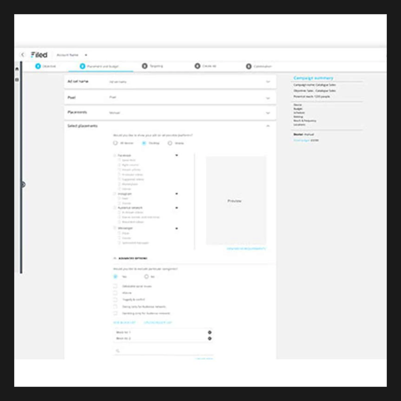
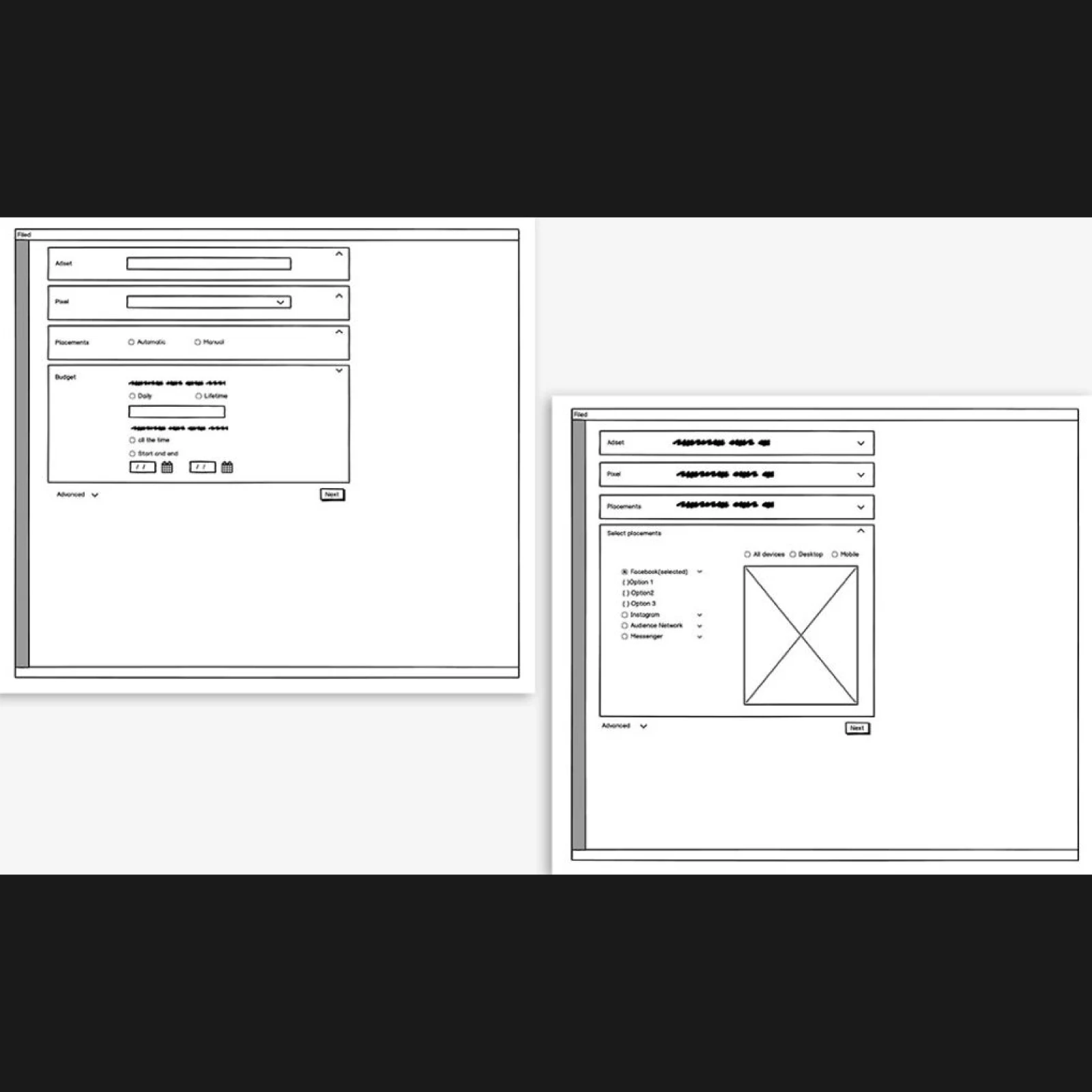
The solution I designed was a parallel pathway system — two distinct routes through the same campaign creation process, sharing the same underlying data and AI engine, but surfacing information and options in completely different ways based on user context.
This was my idea, developed through conversations with the performance marketers we were working with. The insight came from watching expert users in research sessions — they weren't frustrated by complexity, they were frustrated by opacity. They wanted to see what the AI was doing and why, not just accept its recommendations. Beginners wanted the opposite — just tell me what to do.
A step-by-step campaign builder where the AI made recommendations at each stage and explained them in plain language. Users could accept, adjust or override AI suggestions, but the default path was designed to produce a well-structured campaign without requiring platform expertise. Cognitive load was minimised by showing only the decisions that genuinely mattered at each step.
A faster, more direct interface that exposed the full campaign structure and AI logic simultaneously. Experts could see what the AI was suggesting, understand why, and override specific elements while accepting others. The system remembered preferences and adapted over time — learning what each user's campaigns looked like and surfacing that context in future sessions.
Both pathways fed into the same campaign structure and the same AI optimisation engine. A campaign built in guided mode could be switched to pro mode for editing without losing any data. This meant Filed was genuinely one product — not two products with different feature sets — which was critical for the business model and for users who grew in confidence over time.
Design system and UI
The product UI was designed in parallel with the brand identity — so the experience inside the platform felt like a continuation of the Filed brand rather than a separate product. The same typographic system, the same colour palette, the same language principles applied throughout.
The data visualisation within the dashboard was deliberately kept calm and scannable — the AI was generating significant volumes of campaign data, and the design challenge was surfacing the decisions that needed human attention without overwhelming users with information they didn't need to act on.
The outcome
The parallel pathway system solved the core UX challenge at the heart of Filed: designing a product that could support both experienced performance marketers and users with little or no advertising expertise without compromising the experience for either group.
By adapting the interface to different levels of knowledge and confidence, the platform reduced campaign build times by 80% while maintaining transparency and control for expert users. The result was a product experience that made sophisticated advertising technology feel approachable, understandable and genuinely useful.
More broadly, the project demonstrated that designing for different user types doesn't require different products. By understanding how each group thinks, what they need and where they lose confidence, it's possible to create a single system that adapts to the user rather than forcing the user to adapt to the product.
Although the product's future development was ultimately affected by changes to Facebook's API policies, the project remains a strong example of how research, product strategy and user-centred design can work together to make complex AI-powered technology accessible to a wider audience.