The problem
The Adversent dashboard had a structural conflict baked into its original design. It was trying to support two fundamentally different user behaviours at the same time — open-ended browsing for users exploring what was available, and structured progression for users working through a course they'd enrolled in.
The result was an interface that did neither well. New users felt lost because there was no clear starting point. Returning users couldn't quickly find where they'd left off. Completion rates were suffering because the experience didn't give users enough momentum to keep going.
Online learning has a well-documented drop-off problem — most platforms lose the majority of enrolled users after the first session. The dashboard redesign was specifically focused on solving that.
The insight was that discovery and progression aren't competing behaviours — they happen at different moments. The dashboard needed to know which moment the user was in.
Research and reframing
Rather than treating discovery and progression as two modes that needed their own interfaces, I reframed the problem. The real issue was that the dashboard didn't know anything about the user's context — it showed the same interface to a brand new visitor and someone halfway through their third course.
Analysed how early users were actually moving through the platform — where they entered, where they dropped off, and what patterns distinguished users who completed courses from those who abandoned them after one or two sessions. The data showed that completion was strongly correlated with how quickly users found their next step after logging in.
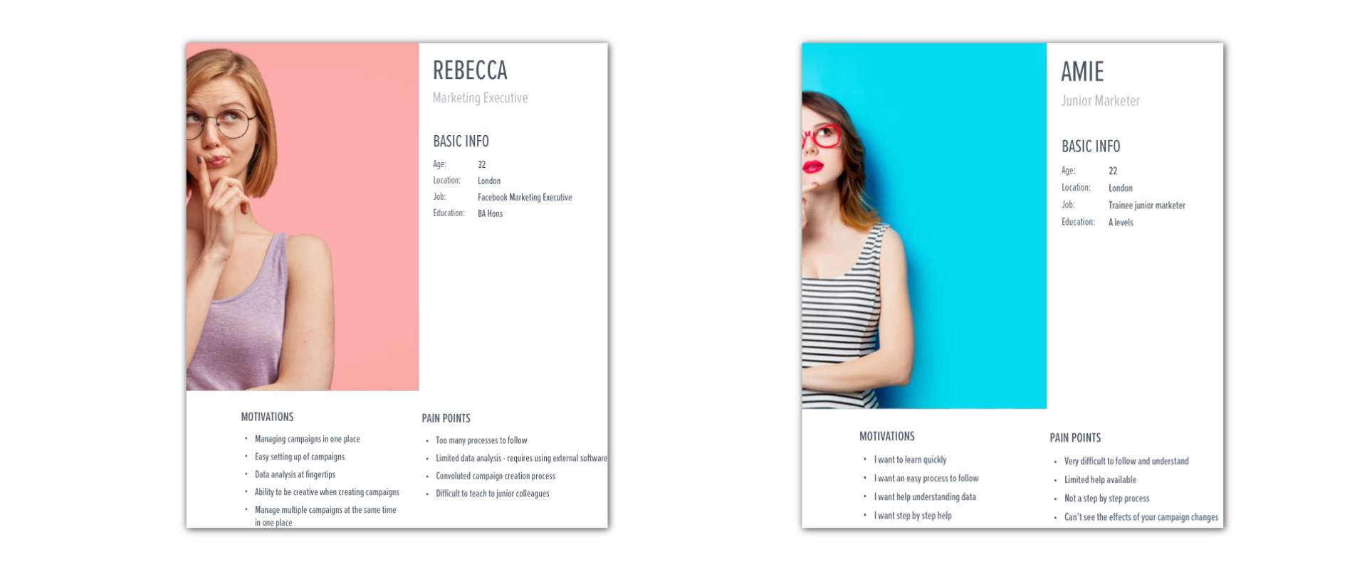
Mapped the full user journey from first visit through to course completion across three distinct user states: new users exploring the platform, enrolled users returning to continue a course, and users between courses deciding what to do next. Each state had completely different needs from the dashboard.
Built and tested prototypes with real users before committing to development. Validated the adaptive dashboard concept — where the interface prioritised different content based on user state — against the original design. The adaptive version consistently reduced time-to-next-lesson for returning users.
The design solution
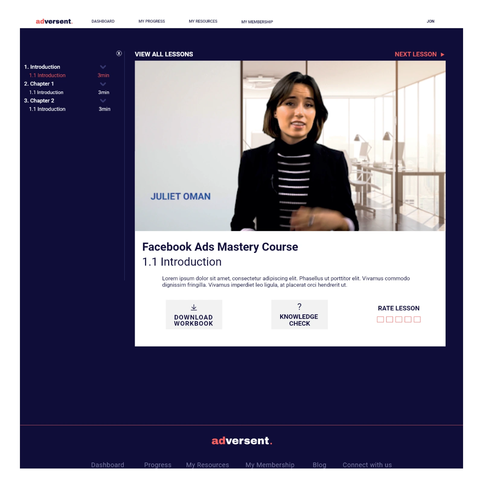
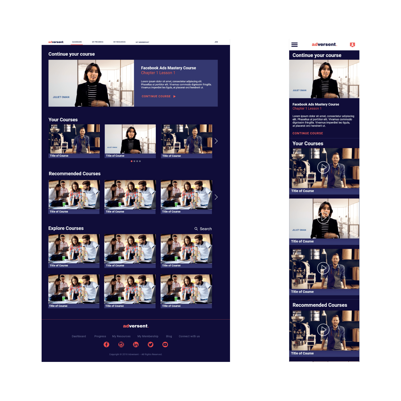
The redesigned dashboard used a modular card system that adapted to user context. Returning users saw their active courses and their next lesson immediately — no searching, no scrolling. New users were guided through curated starting points based on their stated goals rather than being dropped into a content library with no direction.
- Adaptive homepage layout — the primary content surface changed based on whether the user had active courses, completed courses, or was new to the platform.
- Modular card system built to surface different content types — courses, progress states, recommendations and achievements — in a consistent visual language that could be extended as the platform grew.
- Progress indicators designed to encourage continuation without creating anxiety — visible momentum rather than a countdown to completion.
- Continue watching as the primary CTA for returning users — borrowed directly from the Netflix reference point, reducing friction to re-engagement to a single tap.
- Design system established for the full platform — not just the dashboard — so future features could be built consistently without revisiting visual decisions each time.
The outcome
The dashboard redesign addressed one of the biggest challenges in online learning: helping users maintain momentum after their initial engagement with a course. By adapting the experience to different user states and reducing the friction involved in finding the next step, the platform created a clearer and more intuitive learning journey.
Early students achieved a 35% course completion rate — a significant result in a category where engagement and retention are persistent challenges. The modular design system also made it faster and easier to introduce new courses, content types and platform features without reworking the underlying experience.
More broadly, the project demonstrated that completion rates in online learning are influenced as much by experience design as content quality. By understanding the different moments users move through — discovery, progression and re-engagement — it was possible to create a dashboard that adapted to their needs rather than presenting the same interface to everyone.
Although the platform's long-term development was ultimately affected by funding constraints, the project remains a strong example of how behavioural insight, UX strategy and system thinking can work together to create more engaging digital learning experiences.