Brand Identity · Website · Motion · Product Design

Filed

Brand identity, website and product design for an AI-driven Facebook advertising platform — built before AI became mainstream, when the idea of a machine learning your campaigns in real time was genuinely new.

The brief

Facebook advertising in 2017 was extraordinarily powerful — and extraordinarily difficult to use. The platform had become so complex that most small and medium businesses either couldn't use it properly or were wasting significant budget through poor campaign structure and targeting. Filed was built to change that.

The proposition was genuinely ambitious: an AI engine that would learn what campaigns worked in your specific industry, guide you through the process of building them, and then optimise them in real time once they were live. I worked alongside an AI specialist who built the engine itself — my role was to design everything the user actually saw and experienced.

The brand challenge

Most AdTech brands look the same — cold blues, dark interfaces, charts everywhere, language full of jargon about performance and conversion. That visual language signals credibility to enterprise buyers but it intimidates the SMB market Filed was primarily targeting.

The brand needed to feel like it was on your side — approachable and human enough for a small business owner, technically credible enough for a performance marketer. That's a harder balance than it sounds.

The brand needed to feel like it was built for people who wanted results, not people who wanted to understand algorithms.

Visual identity decisions

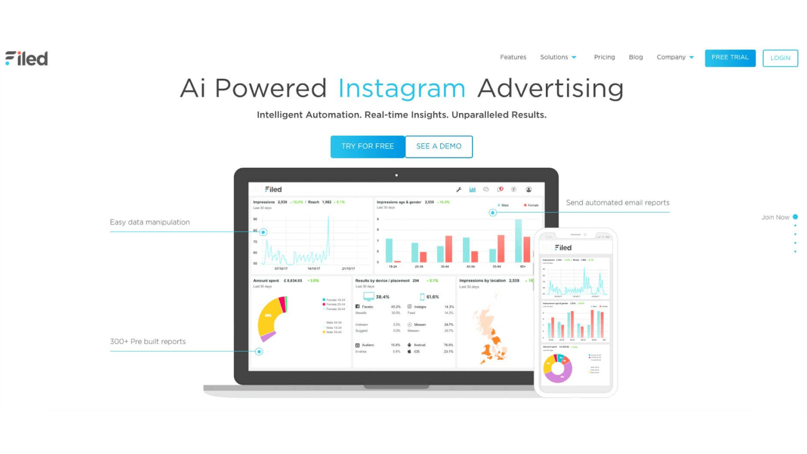
The most deliberate decision was the colour palette. I chose sky blue and coral — warm, energetic and distinctly human — specifically to break away from the cold corporate blues that dominated the AdTech space. The palette said "friendly and capable" rather than "technically impressive but intimidating."

Colour palette

Sky blue and coral as primary brand colours — deliberately warm and approachable, a direct departure from the cold blues and greys that most competing platforms used. Chosen to feel human first, technical second.

Typography & tone

Clean, modern sans-serif throughout — no serif heritage, no aggressive display fonts. The typographic system needed to work across marketing materials and product UI without feeling like two different brands. Language focused on outcomes, not technology.
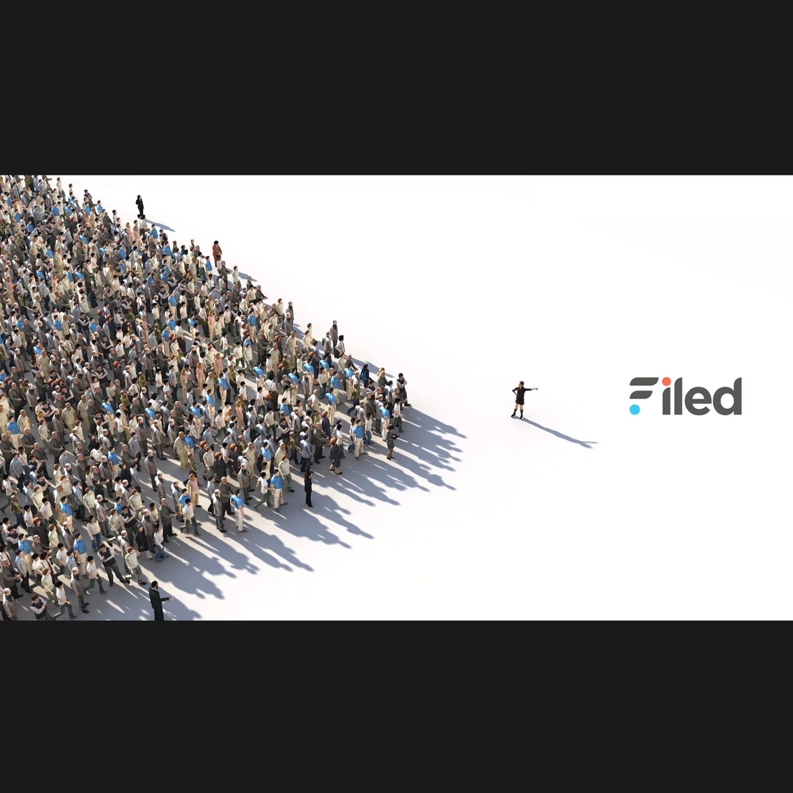
Illustration system

Isometric 3D illustrations rather than product screenshots for marketing materials — a deliberate choice to explain complex concepts visually without exposing the product before it was ready, and to give the brand a distinctive visual style competitors couldn't easily replicate.

Filed Brand Identity System

Website & marketing

The website was the primary sales tool — Filed was a subscription SaaS product so the site needed to convert visitors without a sales team doing the heavy lifting. The information architecture was built around a clear hierarchy: problem first, solution second, proof third.

The stat tiles — 80% reduction in campaign build time, £200 million in revenue generated from optimised campaigns — were designed to do real commercial work on the page. Bold enough to stop a scrolling visitor, credible enough to hold scrutiny. Lifestyle photography cut-outs against the brand colour blocks gave the statistics warmth and personality rather than making them feel like a data sheet.

  • Website designed and built to convert without a sales team — clear conversion pathways from landing to free trial sign-up.
  • Motion and video content produced to explain the AI proposition in language non-technical users could understand.
  • Marketing collateral and social assets built on the same visual system — consistent brand language across all touchpoints.
  • Product UI designed in parallel with the brand — so the experience inside the platform felt like a continuation of the brand rather than a different product entirely.

The outcome

Filed launched with a brand and product that positioned it credibly in a competitive market — clear, human, and commercially polished. The platform generated real results for early customers, with campaign build times reduced by 80% and significant measurable revenue attributed to AI-optimised campaigns.

The product was killed not by a product failure but by an external platform decision — the Facebook API controversy of 2018 removed access to the data that made the AI engine work. It was a genuinely difficult moment: a well-built product, a strong brand, and a real market need — undone by a platform decision we had no control over. That's the reality of building on top of someone else's infrastructure.

What the project demonstrated was that the right brand positioning — human over technical, outcome over process — can make a complex AI product feel accessible to exactly the audience it needs to reach.

Filed Brand Assets
Filed Marketing Collateral

Want to see the UX and product design process in detail?

View UX case study →
Next Project → Adversent