The brief
Adversent was a brand new e-learning platform built to help beginners and experienced marketers improve their skills in Facebook, Google and YouTube advertising. The market was crowded with generic course platforms — dry, generic and uninspiring. The brief was to build something that felt completely different.
I led everything: brand identity, website, platform UX, dashboard design, eBook production, and the video content itself — directing shoots with actors in a production studio and overseeing the editing, graphics and sound.
The brand
Most e-learning brands look the same — corporate blues, stock photography, badges and progress bars. Adversent needed to look like it was built by people who actually understood advertising, and who respected the intelligence of their audience.
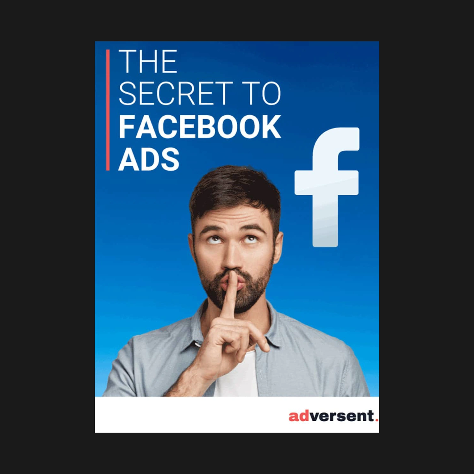
The visual identity was built around a dark navy and coral palette — a deliberate break from the lighter, more academic look of competing platforms. Navy gave it authority and credibility. Coral gave it energy and warmth. The logo treatment — "ad" bold, "versent" lighter — called out the advertising focus immediately while the full stop gave it confidence and finality.
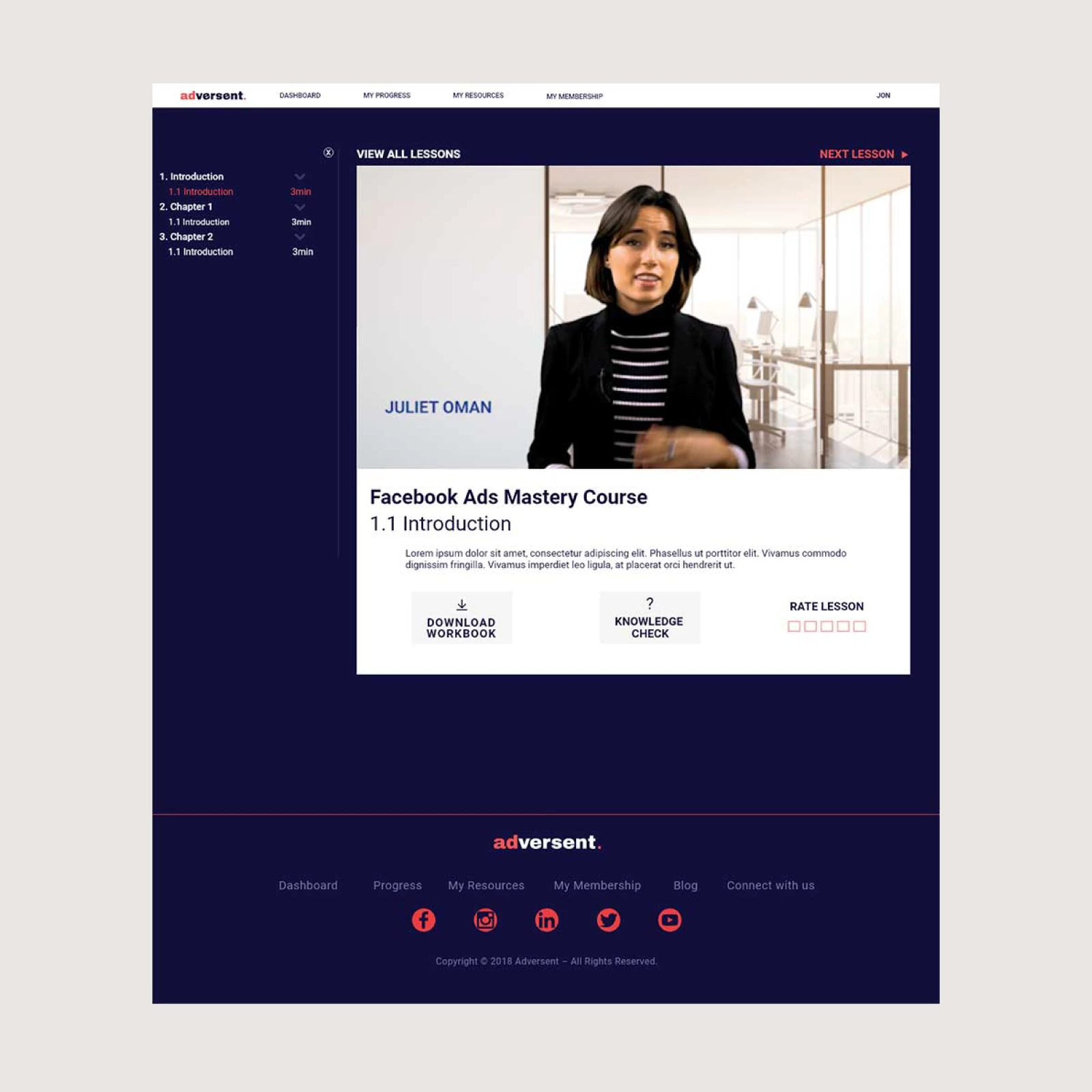
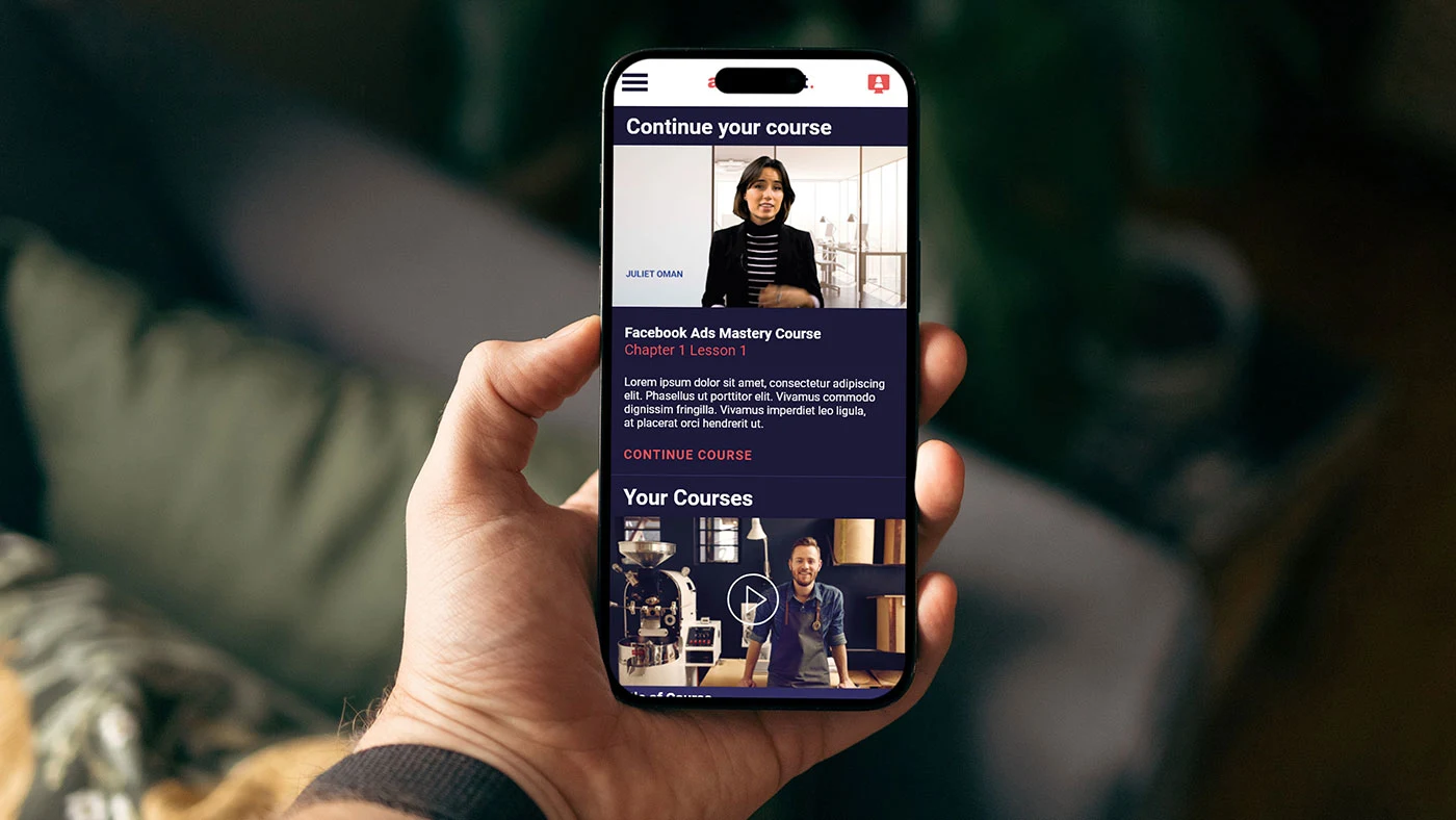
The brief was to build something that felt more like Netflix than an online course — content you'd want to watch, not content you felt obliged to complete.
Visual identity
Dark navy and coral — authoritative and energetic, deliberately different from the pale, academic look of competing platforms. The speech bubble campaign device made the brand immediately approachable and human without sacrificing professional credibility.
Platform experience
Netflix was the reference point throughout. Dark interface, content-first layout, binge-able structure. The platform was designed around the idea that learning should feel like something you choose to do, not something you're required to finish.
Supporting content
Designed a series of eBooks to support each course — downloadable reference material that extended the learning beyond the video. Consistent visual system across platform, video and print so the brand held together across every touchpoint.