Client name withheld Brand Identity · Illustration · Ecommerce · UX

Retail Scale-Up

A new consumer experience brand built from scratch for a millennial audience — city-focused, discovery-led by vibe rather than category, with a bespoke illustration system covering characters, city scenes and location icons across the UK.

The brief

Post-Covid, my employer wanted to launch something new — a consumer experience brand that felt more millennial, more local and more distinctive than anything else in the group. The proposition was discovery by vibe rather than category: instead of browsing by product type, users would find experiences by the feel of their city, the kind of evening they wanted, the energy they were after.

There was no existing brand, no visual language, nothing to work from. Everything was built from scratch. The brief was to create something that felt genuinely different — grungy and characterful in the way that Shoreditch has a character, rather than the polished generic aesthetic of most experience booking platforms.

The illustration system

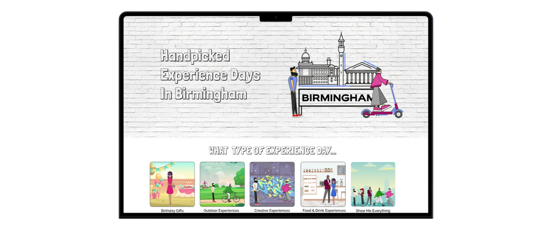
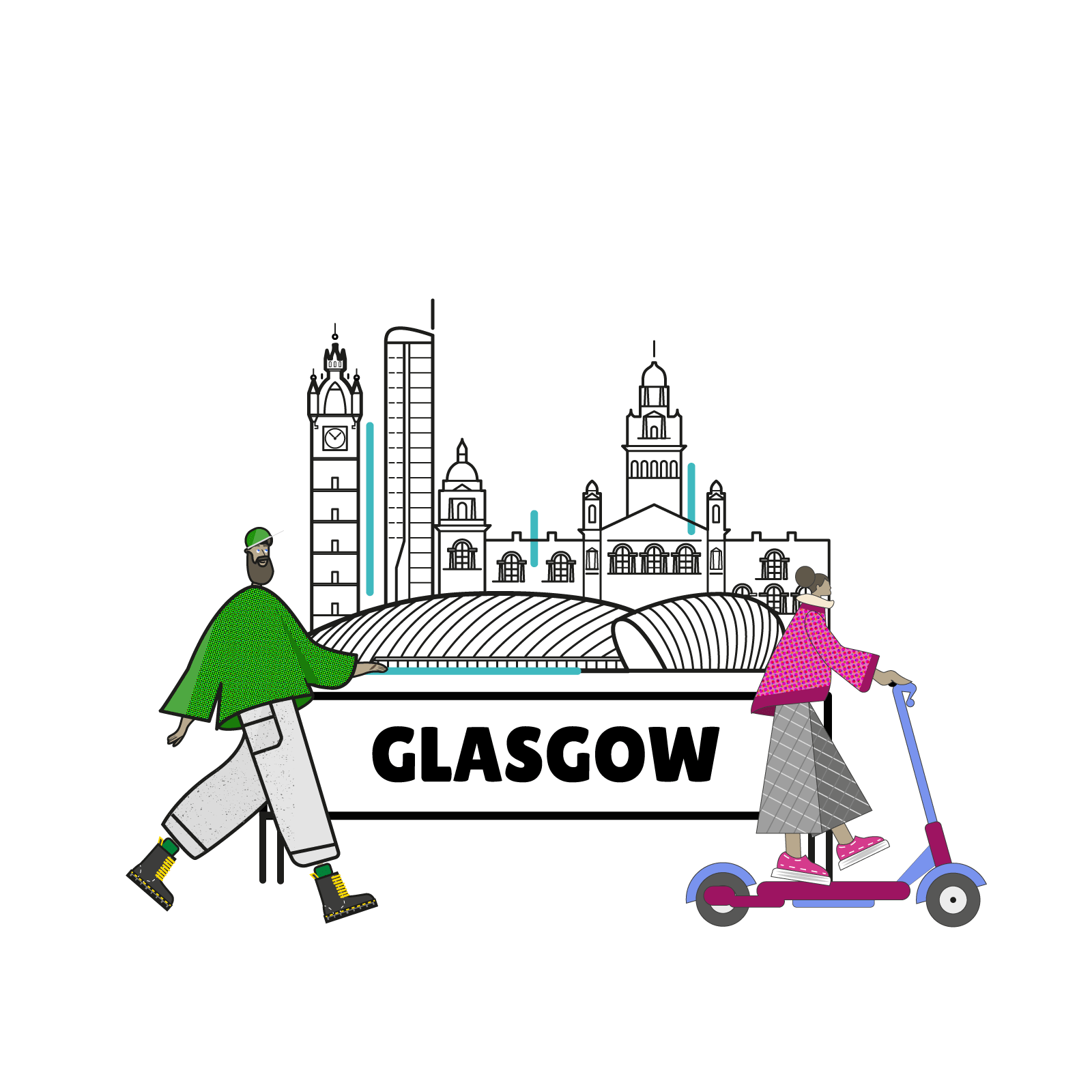
The central creative decision was to build the brand around a bespoke illustration system rather than photography. Illustration gave the brand an immediate visual identity that no competitor could replicate, and allowed us to represent cities in a way that felt genuinely characterful rather than relying on stock imagery of landmarks.

I'd developed an illustration style for earlier work — a handful of characters and scenes that had never been used — and used that as the starting point to build a completely new system for this brand. The cities, the scenes and the icon sets were all new work developed specifically for this brief.

The illustration system gave the brand a visual identity that felt genuinely handmade — the opposite of the polished, generic aesthetic of most experience platforms.

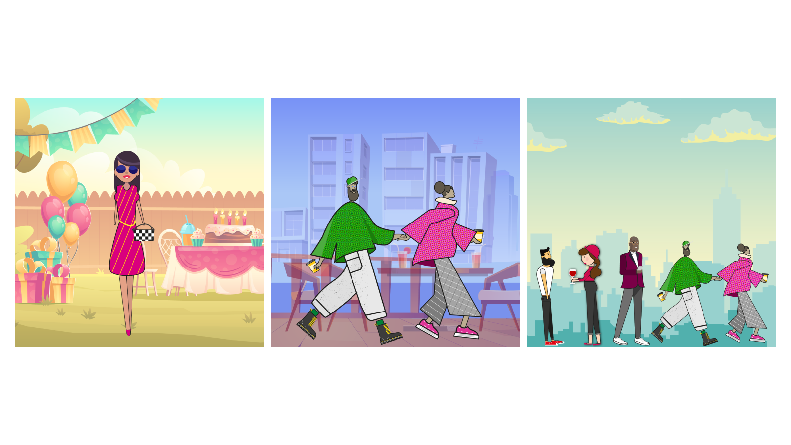
Character illustration

Developed from earlier character studies into a full cast of illustrated figures — diverse, energetic and distinctly non-corporate. Used throughout the brand to give it warmth and personality without relying on photography.

City scene illustration

Bespoke illustrated scenes for each city in the product range — capturing the specific character and vibe of each location rather than generic skyline imagery. Birmingham, London, Manchester and beyond each had their own distinct visual treatment.

Location icon system

A complete set of illustrated icons referencing the character of each city — used for navigation, filtering and wayfinding throughout the ecommerce experience. Instantly recognisable, distinctive and consistent with the wider brand aesthetic.

Retail Scale-Up Brand System

Brand identity

The visual identity was built to feel urban and characterful — type-led, confident, with an edge that referenced street culture and independent creative communities rather than the mainstream leisure market. The palette was deliberately darker and grittier than the typical experience booking aesthetic, which tends toward bright, clean and optimistic.

The illustration system was the primary brand device — it appeared across the website, marketing materials, social content and email campaigns, building a consistent visual world that made the brand immediately recognisable across every touchpoint.

Ecommerce and UX

The ecommerce experience was structured around the discovery-by-vibe proposition — which required a different information architecture to a standard product catalogue. Users needed to be able to browse by feel, by city, by occasion and by energy level, not just by product category.

  • Navigation and filtering designed around vibe and location rather than standard product taxonomy.
  • Product pages designed to sell the experience rather than just list the details — tone of voice, imagery and layout all working together to convey the character of each offering.
  • Mobile-first design throughout — the target audience was primarily browsing and booking on mobile.
  • Illustration deployed at every stage of the journey — from landing page through to booking confirmation — maintaining brand character across the full experience.

The outcome

The brand launched with a visual identity strong enough to pass the curation standards of premium consumer platforms — something that required the brand to feel authentically independent and handcrafted rather than the output of a larger commercial operation. The illustration system was central to that.

What this project demonstrated most clearly was the commercial value of a genuinely distinctive visual identity. In a crowded market, looking different is not an aesthetic choice — it's a competitive advantage. The illustration system gave the brand something no competitor could easily replicate, and it did that work across every touchpoint from the first impression through to the completed booking.

Retail Scale-Up City Illustration
Retail Scale-Up Character Animation
Next Project → MyStylist